
Everyone gets so hyped about their website’s homepage, but I’ll let you in on a little secret: Your homepage is not the most important page on your website, homie.
What your site really needs in order to become a converting machine is optimized landing pages—that’s where the action happens. Good landing pages can make the difference between a website that works hard to do the heavy lifting and one that’s a bit of a slacker—it might look good, but it’s not doing much to help you reach your goals.
Wait, what are landing pages?
They’re the pages on your website that ask your visitors to take specific action. A landing page is the first page people see after they click on an ad, an email, a social media post or maybe after scanning a QR code on a sign or direct mail.
If you’re designing a landing page for a specific marketing campaign, you might ask your visitors to do something like:
- Make a purchase
- Give permission for you to follow up by email, phone, etc.
- Fill out a form
- Sign up for your newsletter or emails
- Enter a giveaway
- Leave a testimonial
Why, though? Why not just send people to my homepage?
Landing pages increase your conversion rates better than your homepage can. Landing pages promote a single objective that matches the intent of the ad (or email or social post) that your visitors clicked on, which creates a more seamless user experience.
A lot of brands and businesses drop people off on their website’s homepage instead of a specific landing page—but that’s like the difference between driving someone to a general neighborhood (and making them find the right address) and Ubering them right to someone’s front door. It’s a lot easier on your rider (aka online visitor) to get them right where you want them rather than asking them to navigate around themselves.
Your homepage is designed with a more general purpose in mind. It speaks to your overall brand and values and typically features links and navigation to other areas of your site—and honestly, it can get distracting.
Landing pages narrow your visitor’s focus and encourage a specific action.
Got it. What do I need on my landing pages then?
Glad you asked. Or I asked. Or someone asked. Regardless of who asked, here’s the answer. Actually, there are five of them.
1. A clear and engaging headline. This should tell the user what the page is about in a concise but compelling way. It’s also a good idea to complement the text that brought the user to that particular page so there’s a seamless flow and familiarity.
When someone clicks on an ad, an email or any other link to get to your landing page, it’s best if the message and language in both places match. (Close is good, exact is best.) This way, they won’t pack up and go home before they even look around. Consistency is key to creating a good user experience. You want to build an easy flow from point A to point B.
2. A brief but descriptive subhead explaining the page’s purpose. Here’s where you can give visitors details about why they’re there and what you want them to do. Writing paragraphs is unnecessary; people won’t read it all. But you do want to be engaging and provide clarity and direction.
Pro tip: People don’t typically read word for word on the web; they like to skim and scan. Use bullet points to drive your main message home with easy-to-read, clear language. If you feel like long blocks of text are necessary, make it obvious that people can and should scroll down—and encourage them to do so. But for best results, use text that quickly describes the action that you want your visitor to take on that page.
3. A clear call to action with a prominent button. Your goal for this page is conversion—you want visitors to click that button. Make your call-to-action specific (Buy Now or Sign Up rather than just Submit) and design the button so it can’t be missed (big, colorful, surrounded by plenty of white space). Be specific about what you want your visitors to do, keep the text short and choose active words.
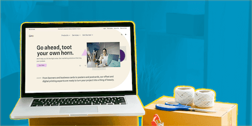
4. Compelling photos that help tell your story. Don’t leave the heavy lifting to the text; photos and videos that evoke emotion and draw a user to the page speak louder than words, so choose wisely. Remember to marry the image with the text—together they should clearly tell your story and explain the course of action you want someone to take.
5. Influential testimonials. Nothing speaks louder than comments and reviews from satisfied customers. Third-party credibility can help boost conversions. Integrate quotes from social media, testimonials and data into your landing page (e.g., “2K people have already downloaded this ebook.”) to make your business even more trustworthy.
One last thing to mention: Eliminate all top navigation from your landing pages. This keeps your user on the page and the focus on the call to action. Your single goal on any landing page is to get them to click that one button. You can provide options for navigating to other pages later.
If you’re unsure how to optimize or create landing pages that’ll get results, tap our PrinterPresence website experts who can help you get started. This really can make a difference in the temperature of your leads and, ultimately, your bottom line.